 Revised Logo
 Color Variations
![]() On a van
On a van
![]() Indoor
Indoor
![]() Outdoor
Outdoor
Revised Logo
Color Variations
![]() On a van
On a van
![]() Indoor
Indoor
![]() Outdoor
Outdoor
![]() Final Logo
Final Logo![]() Color Variations
Color Variations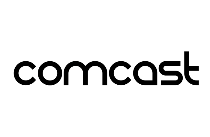 Animated Logo
![]() Exterior Signage
Exterior Signage![]() Interior Signage
Interior Signage![]() Extra
Extra

1) Who is the Client – Amazon
2) What Personality, culture, brand attributes does the logo convey – simple, easy to use, fast, one stop shop
3) Typeface Style (try to identify actual font…know and explore your typefaces) – San Serif
4) Color evaluation – Black and Yellow
5) Competition – New Egg, other online retailers
6) Proposed audience intended to reach/market placement – Everybody who needs to buy things quick.
7) Does logo need refinement? If so, suggested improvements – No, the ad is simple enough and the subtle arrow does a great job in showing that Amazon is the perfect one stop shop.

1) Who is the Client – Tostitos
2) What Personality, culture, brand attributes does the logo convey – Fun, bright, social
3) Typeface Style (try to identify actual font…know and explore your typefaces) – San Serif, custom font
4) Color evaluation – Black, Orange, Yellow, Red, White
5) Competition – Doritos, Fritos, other chips
6) Proposed audience intended to reach/market placement – Young, college aged, perfect for party people.
7) Does logo need refinement? If so, suggested improvements – Yes, the only thing I would want to improve is to reduce the number of colors being used because it is a little too complicated.
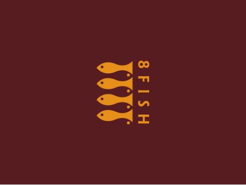
1) Who is the Client – 8 Fish restaurant
2) What Personality, culture, brand attributes does the logo convey – modern, seafood restaurant
3) Typeface Style (try to identify actual font…know and explore your typefaces) – San Serif
4) Color evaluation – Red and yellow
5) Competition – other seafood restaurants
6) Proposed audience intended to reach/market placement – 25-30s with disposable income
7) Does logo need refinement? If so, suggested improvements – The only thing I would want to improve is to make the 8th fish more visible.

1) Who is the Client – Comcast
2) What Personality, culture, brand attributes does the logo convey – Futuristic and Techy
3) Typeface Style (try to identify actual font…know and explore your typefaces) – San Serif
4) Color evaluation – Black and peacock colors
5) Competition – Time Warner Cable, Dish, DirecTV
6) Proposed audience intended to reach/market placement – Everybody who needs a cable tv or phone lines.
7) Does logo need refinement? If so, suggested improvements – Yes, a lot of people see the peacock and immediately think of NBC. I believe Comcast should have it’s own unique logo that will not be mistaken for another’s.
