 Logo
Logo  Print Ad
  Spread 1
  Landing Page
  Online Component
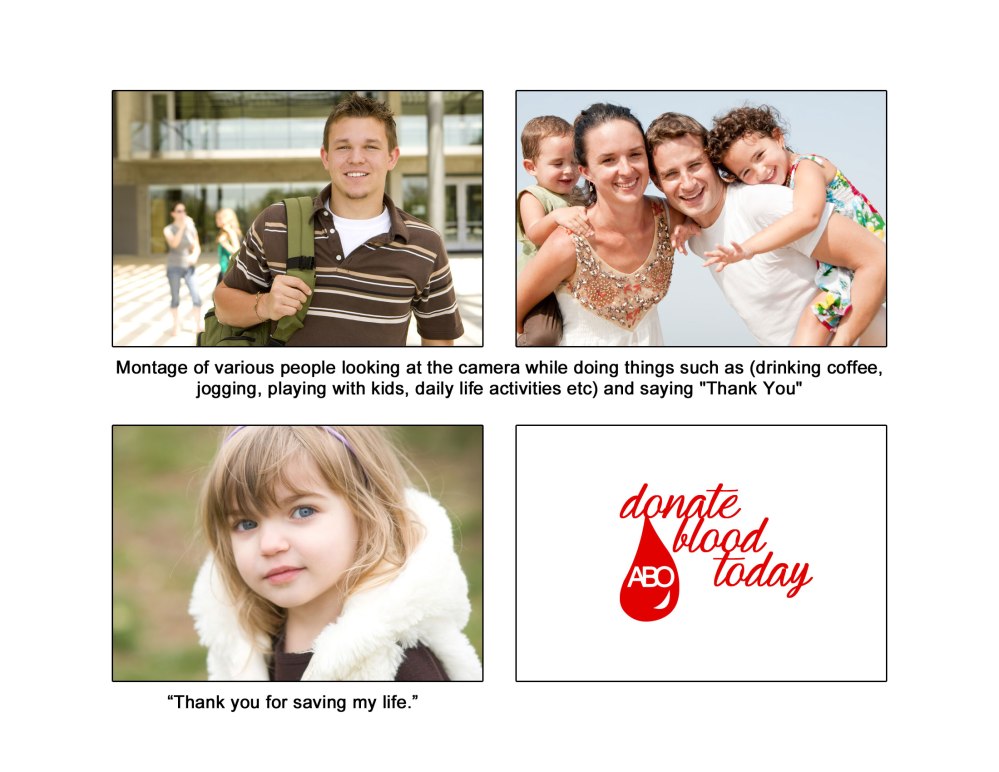
  Story Board
Project Assessment
Name: Tiffany Luke
Course/Time: Jour 343 2PM
Date: 5/12/14
Project Title: PSA Campaign
Terms, Tools you learned and applied: In creating this campaign, one of the most important things I had to keep in mind was to ensure that everything had a consistent look or feel to make sure that the campaign as a whole flowed together. One of the first things I did was set and establish, the font, color, scheme, and imagery I would be using. When it came to design the logo, I wanted the logo to be simple to ensure that it could be scaled at different sizes.
Explain how you went about the project: Well, initially, I wanted to create a campaign centered around overfishing but I had a difficult time coming up with a print ad and copy for the campaign. Eventually, I decided to do blood donations because I had an idea about hands being connected together by blood transfusions. First, I created the logo for the made up company ABO (which stands for each of the blood types), making sure that the logo was able to be scaled and translated into black and white. Next, I made the print ad with the heart and hands. I originally wanted to include a black bar on the bottom but I liked the look of the add with just the text on top of the white background. For the spread and the internet, I wanted to ensure that the campaign as a whole looked cohesive by ensuring that the font, colors, and images were the same. For the commercial, I wanted to focus on the simple imagery from the print ad in order to keep things consistent.
Achieved Goals, were you satisfied with the results? I was definitely satisfied with the results. I felt very accomplished at the end of this project because it really felt like a comprehensive recap of everything I learned this semester.